Kokoro Pathway to Healing is a Reiki-based wellness practice. After years of offering Reiki healing, the founder chose to rebrand to expand her services to include other forms of energy healing.
As a graphic designer and long-time yogi with a personal interest in and appreciation for energy healing, I collaborated closely with the founder to create a new name, logo, and basic brand guideline for future marketing materials.
Kokoro
heart, mind, and spirit in Japanese.
+
A “path” walked together by practitioner and client.
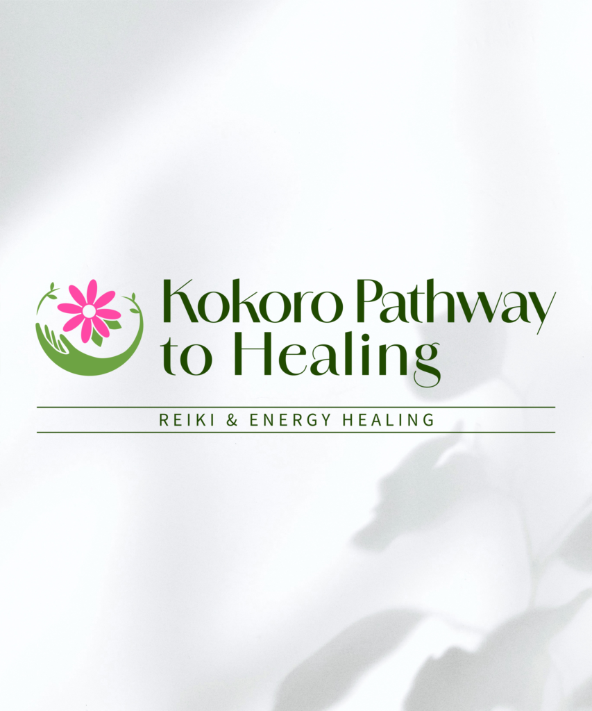
During our discussions, the founder shared her desire for a more inclusive name that reflected healing practices beyond Reiki. We identified her approach as a “path” walked together by practitioner and client, which led to the new name, Kokoro Pathway to Healing. Kokoro, a Japanese word meaning heart, mind, and spirit, reflects the practice’s focus on inner balance and its connection to Reiki’s Japanese origins.
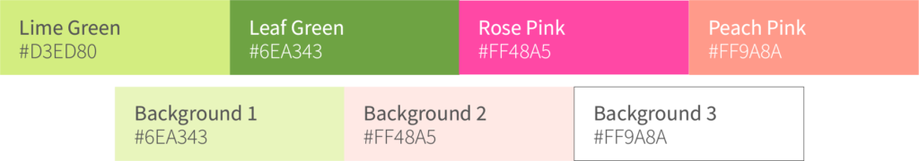
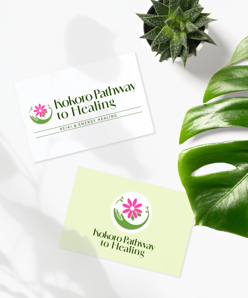
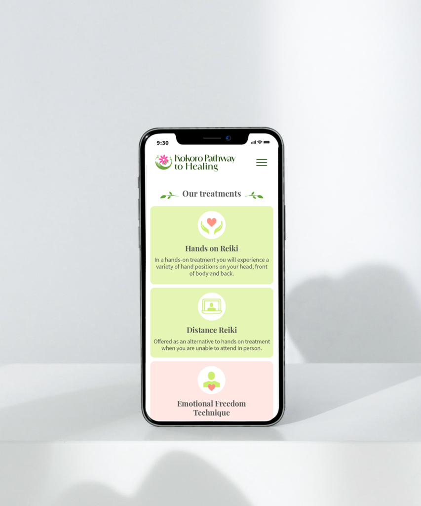
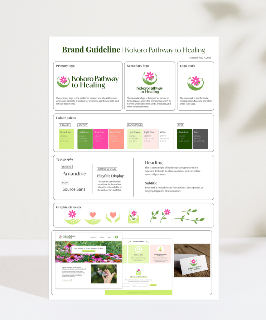
The logo was designed using a mark that combines a hand, flower, and curving line, symbolizing the founder’s love of gardening and her vision for growth and healing. The lime green from the original branding was retained in the new colour palette, honouring the founder’s strong attachment to the colour. A leaf green was added and paired with a soft, organic typeface to create a calm, natural feel.
COLOUR PALETTE
TYPEFACE
The final logo reflects the calm and welcoming atmosphere the founder brings to her practice. Designed in both horizontal and vertical formats, the logo is flexible for use across a variety of applications.